Empathetic Product Redesign:
Understanding The Customer’s Needs
In a crowded market flooded with natural remedies, Native Ceuticals embarked on a mission to stand out by offering transformative, holistic solutions to common health issues. Their commitment extended to meticulously crafting homeopathic formulas infused with locally sourced, natural ingredients from Mooresville, NC.
Despite their dedication, a critical issue emerged: their product names, labels, and packaging failed to align with their brand identity. Seeking a solution, Native Ceuticals turned to TMG Marketing Partners to develop a comprehensive product redesign strategy. The goal was clear: establish consistency across the brand, brand awareness, and impact the community’s health through their products.
Thus, the question arose: what does it take to truly capture attention in today’s competitive market?
Beyond the Ingredients: Introducing Solution-Centric Branding
We at TMG took a unique approach to redesigning Native Ceuticals’ products, distinguishing them from competitors by avoiding ‘CBD’ and ‘THC’ terminology. Why? Because emphasizing the health solutions inherent in all-natural products resonated more with customers.
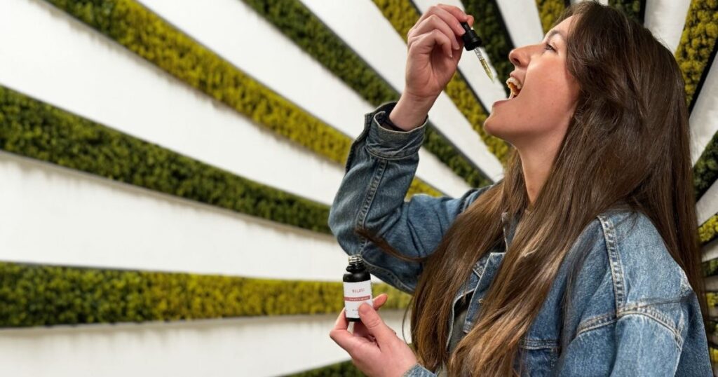
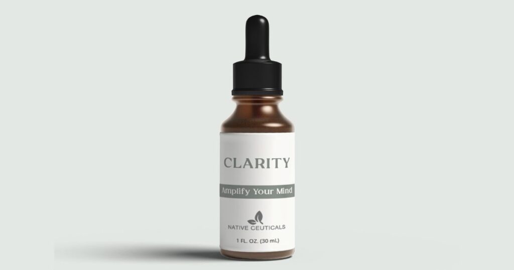
We implemented a packaging redesign strategy focused on the effects of the natural ingredients rather than the ingredient names themselves. To make customers reflect on how they will feel after using the product, we planted the seed and made them imagine relief from their ailments.
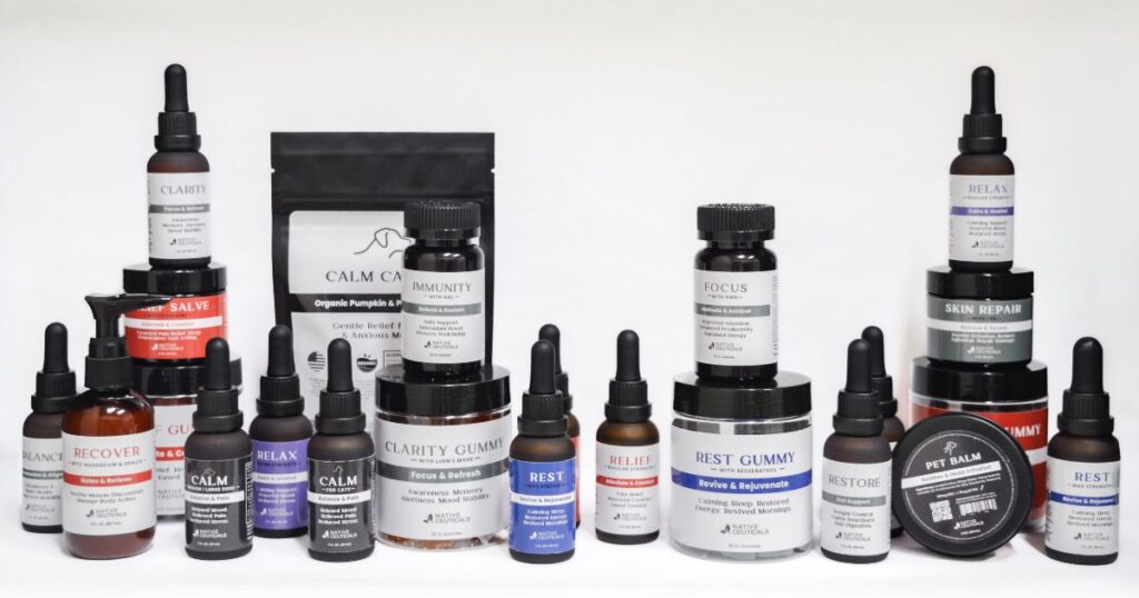
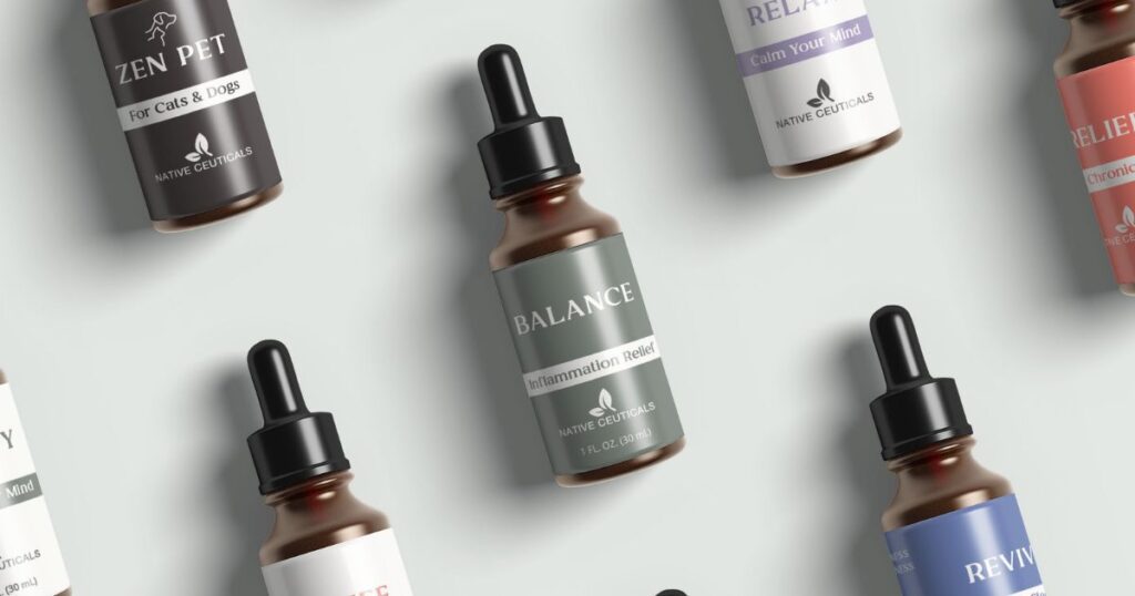
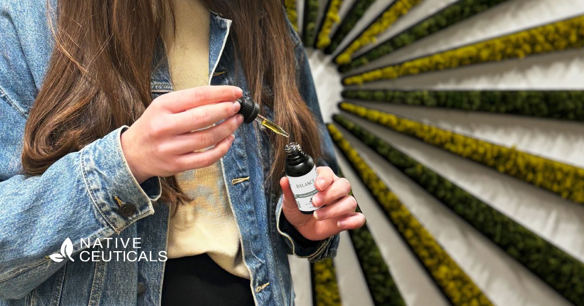
For example, the tincture named ‘Balance’ is more than a list of ingredients, like CBD Isolate and Ashwagandha. It’s an invitation to question what makes you feel unbalanced and presents a tool for obtaining internal balance and harmony.
Unveiling the New Look: Packaging and Label Transformation
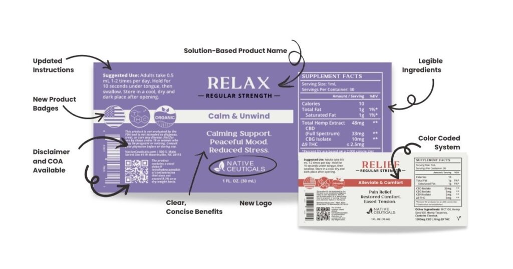
Aligning with Native Ceuticals’ nature-inspired ethos required a significant transformation in packaging and labeling to truly resonate with customers. The journey began with a comprehensive redesign of the packaging’s user experience. Previously cluttered with unscannable QR and bar codes, alongside lengthy and unclear usage instructions, the packaging confused rather than enlightened consumers about the product’s solutions.
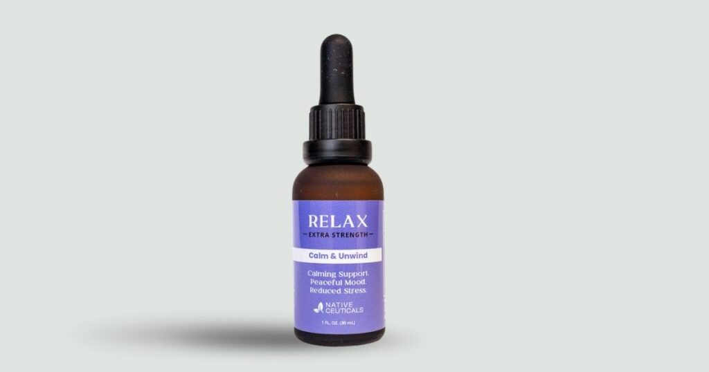
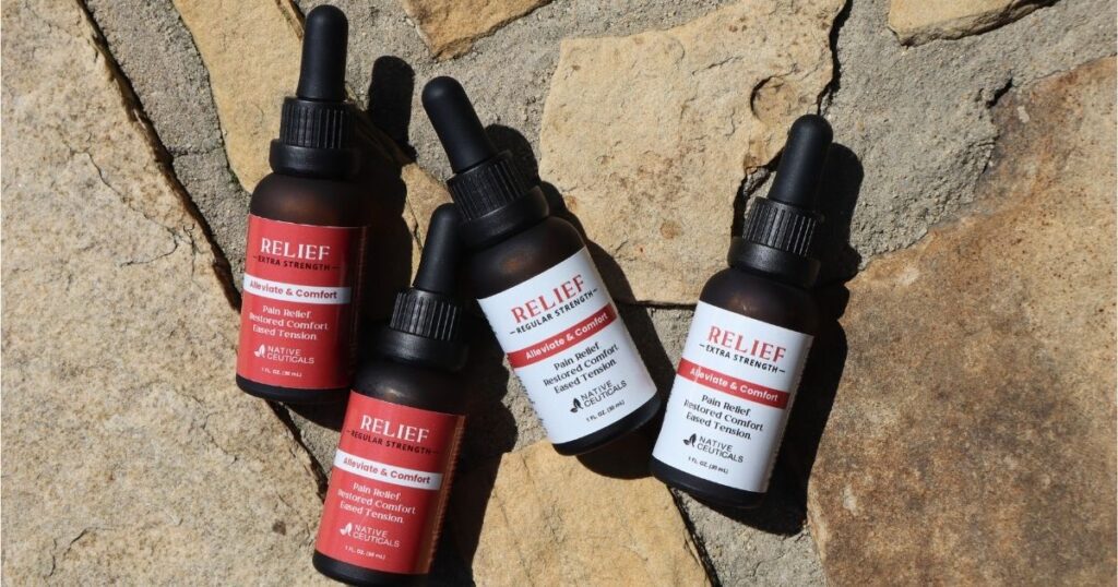
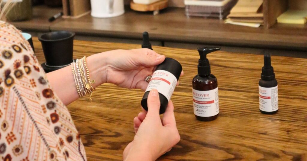
In response, we introduced a series of strategic changes. We transitioned from the stark, uninviting all-black bottles to welcoming, earth-toned amber containers. This shift harmonized with the brand’s natural identity and enhanced product preservation against UV light, contributing to sustainability and extending shelf life. Additionally, we improved readability by enlarging the font, making instructions clearer and more accessible to users.
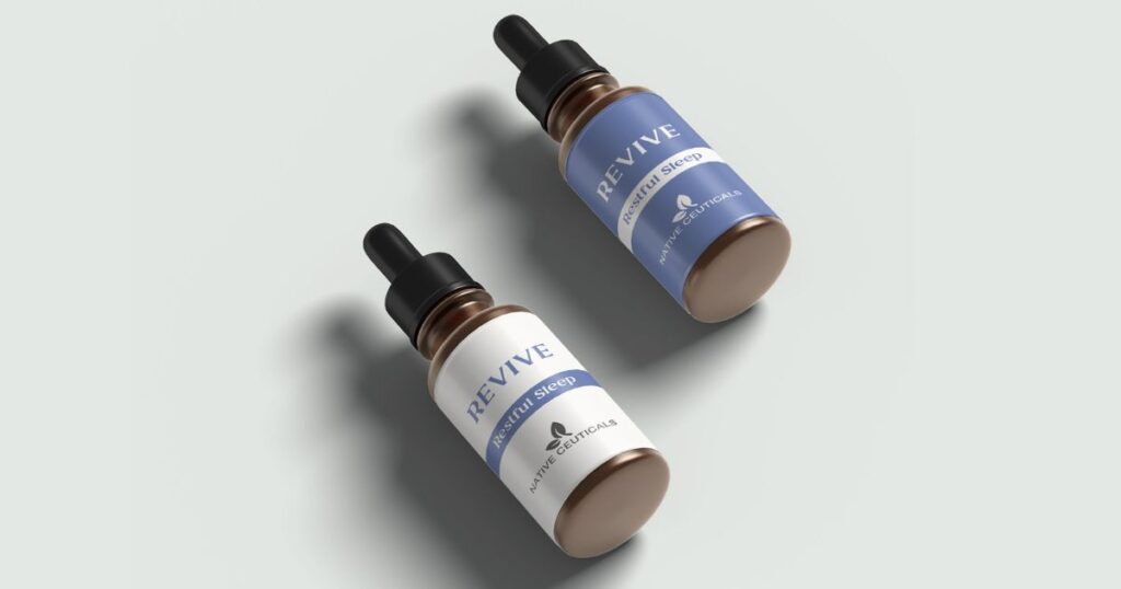
Understanding the concerns of our client’s target audience, particularly the apprehension surrounding THC ingestion, was crucial. To address this, we differentiated non-THC products through a distinctive labeling approach, adopting all-white labels with colored typography to signify purity and THC-free content.
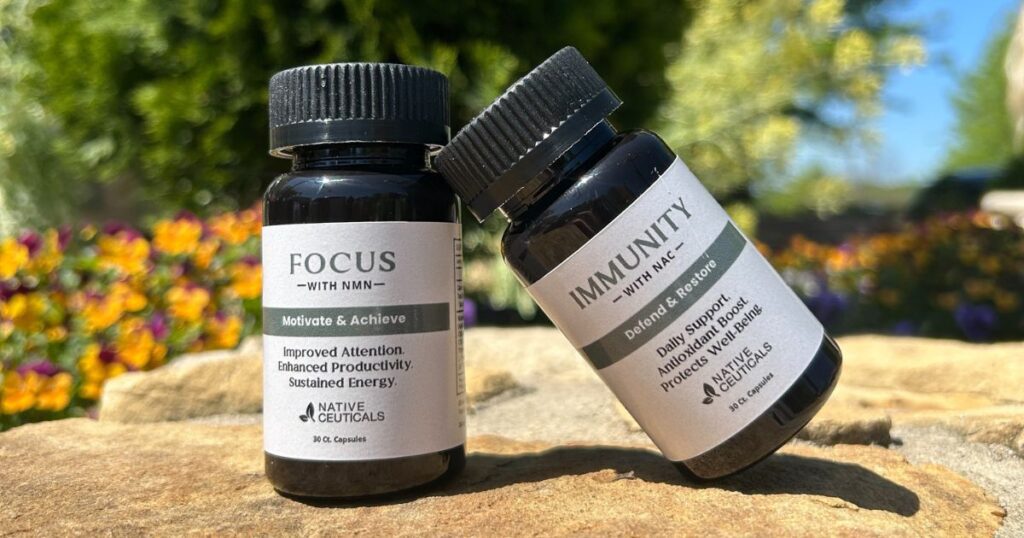
Moreover, the redesign embraced the essence of Native Ceuticals by incorporating new icons that accurately represent the brand’s core values: ingredient transparency, local production, and all-organic elements. These changes clarified product offerings and reinforced the brand’s commitment to quality and customer trust.
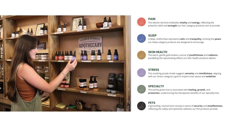
Color Psychology: Harnessing Hue for Impactful Branding
To further enhance user experience, we integrated a color-coded system designed to simplify product selection while tapping into the world of color psychology, ensuring each hue resonated with its intended purpose. Mindful of their commitment to a natural, earth-toned aesthetic, we chose not to saturate the design with overly vibrant colors.
Consequently, we selected a restrained palette that communicates clearly yet subtly. We chose a dusty red for pain relief, conveying vitality and strength, while sleep aids received a serene, muted blue, promoting tranquility and peace. Skin health products are adorned in a soft golden yellow, evoking youth and radiance, whereas products aimed at stress relief are presented in light lavender, symbolizing ambition and spirituality. Specialty items feature an earthy green, representing healing and protection, and our pet product line is marked by deep charcoal, echoing feelings of security and optimism.
The methodical approach of pulling psychology into brand design ensures that each product is easy to identify and aligns with the holistic and therapeutic nature of the brand.
Expertise
Packaging Design & Strategy | Custom Typography & Illustration | Brand Messaging | Color Palette Development | Functional Design Optimization | Brand Image
THE STORY TOLD: A Product Design that Reflects the Brand Identity
After combining our branding and social strategies, Native Ceuticals noticed a significant change in how customers engage with their products.
After the product redesign, the ‘Balance’ tincture became Native Ceuticals’ most successful product launch yet.
Native Ceuticals’ brand image is now consistent across their company and products, reflecting their values.
Now, people across the country recognize Native Ceuticals as a leader in transformative, non-psychoactive, homeopathic remedies.
As Native Ceuticals continues to grow and prosper, they now have a recognizable brand image that resonates with customers.
Through the collaborative efforts of TMG Marketing Partners and Native Ceuticals, we cultivated a robust product brand that seamlessly aligns core values with customer desires. We are so grateful they entrusted us with this huge brand overhaul; we look forward to the next phase of the product development process.
At TMG Marketing Partners, our comprehensive branding services extend beyond product redesign strategies. Regardless of your current branding approach, we’re committed to helping you identify untapped opportunities to engage customers and boost sales.
Ready to navigate your product redesign? Reach out to us to book a 15-minute consultation.